Supply and Demand in Currency Market-part 02
From the last post Supply and Demand in Currency Market-part 01 we know about supply and demand.Now we start the next part in below.Hope its help you to understand the best things.
What is Supply and Demand trading?
Trading in financial instruments, whether it’s Forex, Futures or Equities takes place in markets. We already know that for markets to function it needs sellers and buyers. Supply and Demand is all about spotting where buyers and sellers are sitting on our trading charts. However, we as retail traders do not have access to current order flow. We cannot spot them within their current position. All we can do is looking back [left of our charts] to history and define previous Supply and Demand zones with the expectation that in those zones will still exist some serious buyers and sellers.
Using lagging Supply and Demand information, we are making our trading decision based on historical data, not the current definitive data. We also know that what has happened in the past will not necessarily repeat at present time. We have probabilities to deal with. We use price action chart and candle patterns to improve probabilities in our favor.
There is one important difference between classic Supply and Demand theory and Supply and Demand that applies to traders. While on classic approach suppliers generally stays as suppliers in the process of exchange, however in trading we cannot identify certain participants as sellers or buyers. All participants in trading can be buyers or sellers at any one time, even at the same time.
Remember, trading means buying and selling. Buyers don’t turn into sellers and vise verse. They already are both. When applying Supply and Demand in trading keep this in mind.
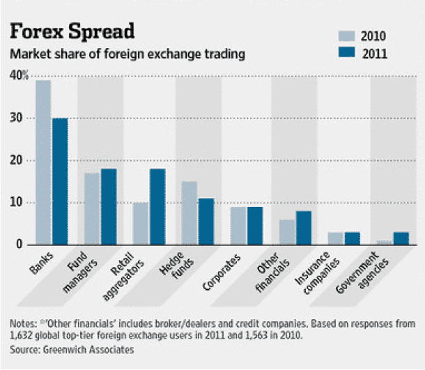
Foreign-exchange market has many participants in various class and size.
Figure
As we can see from the above graph Banksters are firmly in control of Forex. In spite of healthy growth of retailers market share, banksters will remain in control. Even if market share of retailers hit similar levels of banksters, they will still be in control. a. Banksters generally act in sync like one big cartel b. Many funds and insurance companies are extensions of banksters c. Retailers are extremely fractured and cannot act in sync.
According to the graph above, retailers represent 18% of $4 trillion a day forex market as of 2011. That represents hundreds of billions of dollars up for grab on daily basis. Unfortunately, it’s mainly grabbed by banksters.
Our task here clearly is to spot banksters and follow them. Forget about novice trader talk. We don’t care who is on the other side of our trade as long as we are at the winning side. I have seen many non-novice so called pro traders and institutions loosing large sums to markets. We don’t care about losers, our task is to identify winners and follow them. Remember, we do not anticipate but with guidance of the price we try to participate. That’s all. Nothing more, nothing less.
How to identify and draw Supply and Demand zones on a trading chart?
Well, you don’t have to. There is a freely available indicator does it for you automatically. Instead of spending time on drawing and updating your zones manually, it may be more beneficial for your trading to watch PA and check out historical price levels.
For those, who like to understand how zones are defined on a trading chart let’s try to demystify it.
There are three types of price moves in markets.
- Going up
- Going down
- Going sideways or nowhere [ranging]
There are some fancy terms circulating around to keep you busy for the purpose of expanding learning process for paid mentoring services or some who likes to keep their website busy with useless stuff. My advice is to keep clear of such complications as they are not aimed to improve your trading. Unfortunately many new traders would be getting caught in these useless jargons and end up wasting their time.
What the heck are all these DBD-RBR-DBR-RBD?
Apparently they stand for:
DBD means Drop Base Drop
RBR means Rally Base Rally
DBR means Drop Base Rally
RBD means Rally Base Drop
Price drops and rise with flags, pennants and various chart – candlestick patterns or without out them. That’s it. Why make things complicated? Keep in mind complicated things bound fail sooner or later.
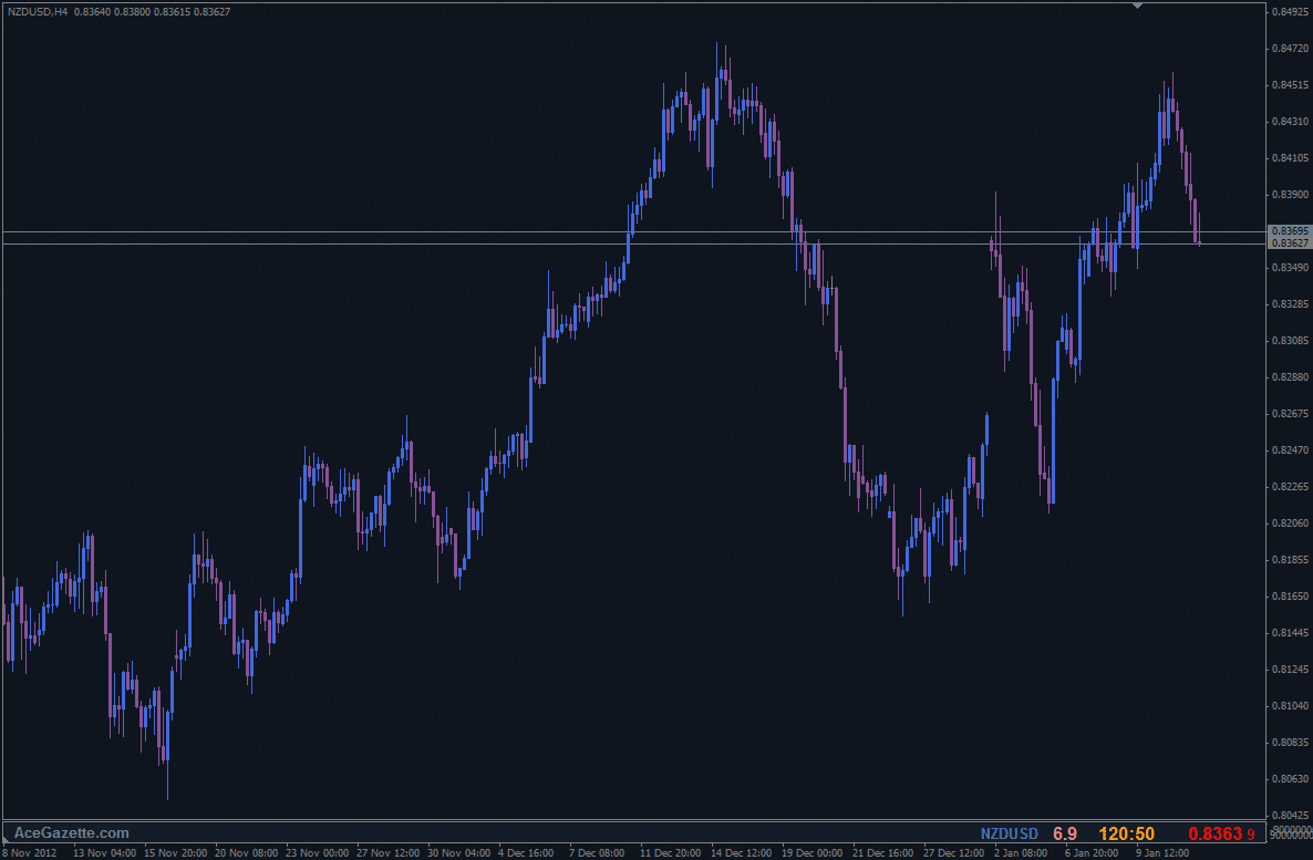
Chart 1
Here we have a chart without any markings other than ask and bid price lines. Where are supply and demand zones?
A supply and Demand zone indicates price turning areas, where price reaches a point that balance will change in favor of other participants. It’s the tipping point where imbalance between buyers and sellers is at peak. When imbalance is at its peak, change in direction is bound to follow.
For instance, when balance is on buyers’ side we see price is going up. Simply, there are more buyers than sellers at those prices. However, once the price reaches to certain levels, participants start thinking price become too expensive, they start selling at new highs to maximize their profit. Additionally, certain participants would have exhausted their resources during their buying activity and there will be certain participants waiting on certain levels to sell too, which helps to cement a decent supply zone. Now, we have new sellers entering to the market plus some of those buyers closing their buys and joining in as sellers. Price will be travelling down until it finds the demand [where buying interests supersede selling ones].
So, supply and demand zones don’t represent magical decision points as some may be stating, but rather zones representing imbalance at its peak. You can pour so much of water into a glass. Just like in classical supply and demand theory. Suppliers can increase their prices so much, perhaps until there are not enough people willing to buy their products or services at those prices. Unless the supplier is a bone headed with a gigantic ego then he has to reduce his prices to get buyers interested once again.
However, we also know that heavy manipulation is going on in markets. We simply couldn’t say natural laws of supply and demand. Remember fake-outs!
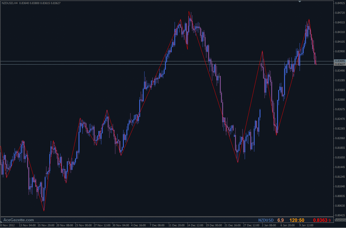
Let’s use good old zigzag indicator as a visual helper to see peeks and drops clearly rather than polluting our heads with DBD-RBR-DBR-RBD stuff.
Chart 2
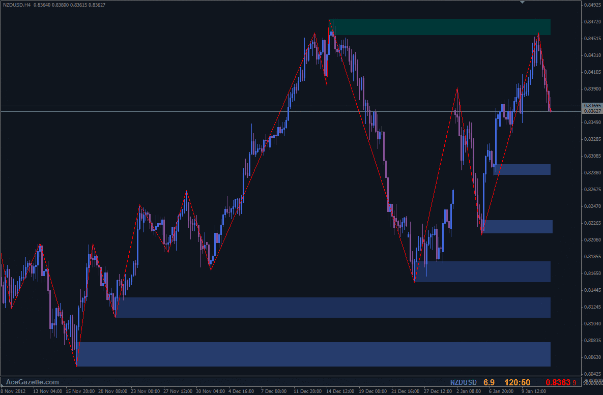
With the help of zigzag indicator we can identify major and minor price turning zones including older ones with ease. Now lets add supply and demand zones to the chart ignoring minor/weak zones.
Chart 3
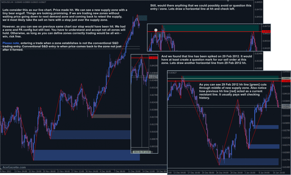
Notice where zones are drawn in relation to zigzag highs and lows. It’s not a big deal to recognize possible supply and demand zones, is it? I used default settings of the zigzag indicator.It’s fine looking at history and talking on hindsight but how do we know current higher high [hh] is the actual hh?
Chart 4
Supply and Demand in Currency Market-part 03 upcoming……….

0 thoughts on “Supply and Demand in Currency Market-part 02”